| Hello! Here at MorningPrint, we receive many amazing designs, and we really enjoy seeing the creative process the designers go through. We enjoy seeing the results received after we send these designs to print. We would like to share some of these creative designs with you to help inspire you as they have inspired us. |
|
|
|
| |
 |
| |
 |
| |
 |
| |
 |
| |
 |
| REVIEW |
| Q : We receive more and more wedding announcement designs at MorningPrint and we're always impressed by the creativity our customers express in each design that range from simple and conservative to vibrant and eclectic. Have you noticed a trend in people reaching out to designers for help with their wedding designs? |
| A : Because weddings are by and far my favorite thing to design for, I'm very happy to say that I see a substantial increase in the amount of people choosing professionally handcrafted invitations. A wedding is such a monumental, life-changing thing, and brides and grooms are really marking the celebration with design quality that rises to the occasion. |
|
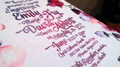
| Q : How did you and your client decide on this bold floral motif? |
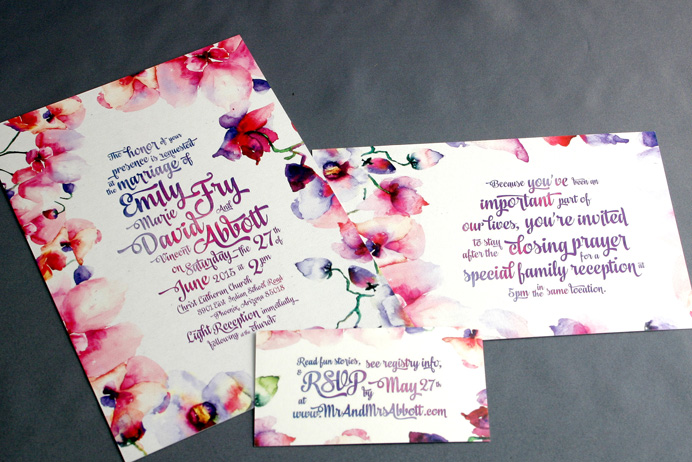
| A: My client Emily loves orchids, and after talking with her, I learned that orchids would be central to her wedding day theme. One of the coolest parts about designing invitations is getting to bring a design full circle so brides really feel like they're getting the royal treatment. So bright, colorful orchids won't just be there on her wedding day, but will be carried throughout her invitations, wedding website and more. |
|
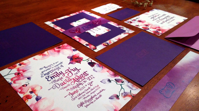
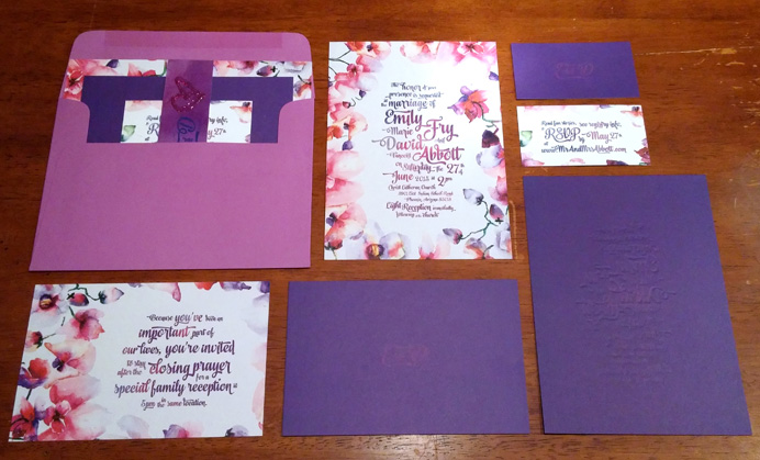
| Q : I think this is the first time we've received a wedding order that includes three of our products: the 5X7 postcard, the 4X6 postcard and standard business card size. How did you decide to use all three card stocks and which information to put on each? |
| A: Going farther than just a single 5x7 card really lends a sense of fullness and luxury to the whole experience of opening up a big colorful invitation package that has your name on it. It also allows for cleaner communication by separating out different elements of the invite into main info, an RSVP postcard, and extras like where the couple is registered. |
|
| Q : These days, many wedding announcements extend beyond print and into websites that require fluidity between what's on paper and what's on screen. Are you helping your client with any web design or do you prefer to stick to print? |
| A: I typically provide my brides with the whole nine yards, and it's a blast watching it come full circle. Invites, sign posts, programs, and finally, a matching website. See the site that matches this design here: www.MrAndMrsAbbott.com |
|
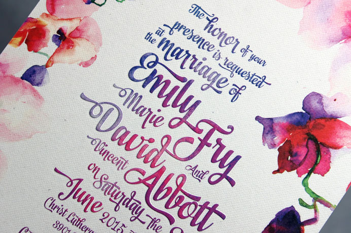
| Q : Your wedding announcement is very impressive and it's obvious that you are no stranger to typography. How did you decide on this font and is there any particular reason you decided not to pair it with another font? |
A: It was all the client.
Emily is a uniquely joyful, colorful bride-to-be. The kind of person that makes you wonder why you worry about anything. It was clear after doing a creative brief with her that she was not interested in anything stuffy, orderly, or pretentious. No straight lines; no rigid fonts. These invitations needed to reflect her wedding, and her personality: fun, wild, colorful, and boldly whimsical. This led me to the playful script typeface you see now.
|
|
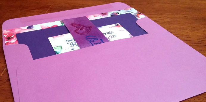
| Q : A lot of the wedding announcements orders we receive feature a type of foiling or embossing, as seen on the largest postcard of your wedding kit. Had you considered using foiling for your design or did you know that you wanted to stick with the elegant effect that embossing brings to the invite? |
| A: Embossing, besides being classy as all get out, accentuates the tactile, organic impression of the cards with its subtle raised surface. This was perfect for a design that centers around organic brush strokes, and has the look of a textured canvas you can really feel on your fingertips. Foiling I tend to save for polished, sleek looks. |
|
| Q : What has been your experience using MorningPrint? Did you experience any difficulties with the site, or find anything to be inconvenient or inefficient? |
| A: As a designer, I love Morning Print. The prices are way low, they have a ton of fun options to get creative with, and their customer service has been on point every time I've contacted them. |
|
| Q : Do you have any tips for our clients who are considering designing their own wedding announcements or considering bringing in a designer to help with their announcements? |
A:This may sound weird coming from a wedding invitation designer, but I would say: There is nothing wrong with DIYing your own invitations. Sometimes, a professional designer just isn't in the budget.
That being said, having invitations professionally hand crafted takes a wedding to a whole new level. It makes a big first impression to your guests, letting them know from the onset that this whole party is going to be thoroughly awesome with creative and thoughtful details that make the day feel truly special.
|
|
%20 Off Special at www.CourtneyMansell.com
Courtney Mansell is a Southern California based graphic designer by day, competitive swing dancer by night. You can see her work and bask in the wonderment of her creativity at www.CourtneyMansell.com. Mention MorningPrint any time during the month of May and get a free consultation and 20% off any design service from logos to business cards to wedding invitations.
|
|


 About Us >
이달의명함
About Us >
이달의명함