| Hello! Here at MorningPrint, we receive many amazing designs, and we really enjoy seeing the creative process the designers go through. We enjoy seeing the results received after we send these designs to print. We would like to share some of these creative designs with you to help inspire you as they have inspired us. | |
|
|
|
 |
 |
 |
| REVIEW |
| Q : Briefly tell us about your company, and its history. What kind of services you offer? |
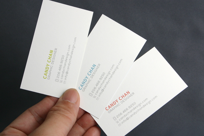
| A : I am a graphic designer. I recently graduated and received my BFA degree from the Art Institute of Seattle. My main focuses are graphic design, layout design, web interface design, branding, packaging design and other visual designs. Feel free to send me an email if there are any questions. | |
| Q : Your design inspires us, what inspires you? ? |
| A: I was born and raised in Hong Kong, but I am strongly influenced by Japanese designs. Hong Kong??s fashions and graphic designs are heavily related to Japanese culture. I grew up with Japanese fashion magazines, Japanese packaging designs and Japanese graphics; I enjoy their simple yet sophisticated layouts and graphics. Besides, I studied graphic design in the States and I fell in love with minimal design. My inspirations are between the East and West due to my background. | |
| Q : We love your design, it is simple, bold, and playful while still being simple, clean, and minimal. How did you come up with this design / concept? |
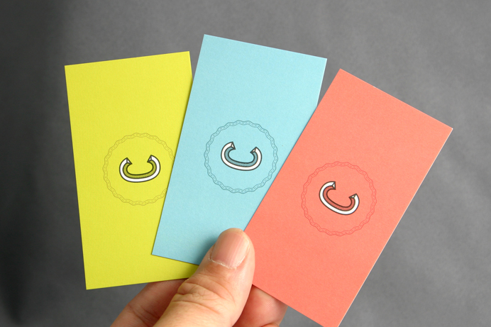
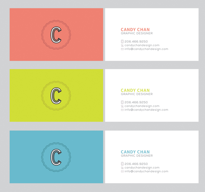
| A: The mark is my logo, which says ??CC?? which stands for ??Candy Chan??. I like to keep my design simple and direct so the information is easy to reach. The content of a design should stand out. As I mentioned, I love minimal design so I keep no extra elements on my design, everything is there for a reason. | |
| Q : You created 3 sets, all with different colors. We love this idea of an option of color / flavor. Why did you decide to go this route? |
| A: I want to present myself as a versatile designer by using three different shades for my brand. The green stands for modern, youth and organic; the pink stands for feminine, elegance and flexibility; the blue stands for professional, trustworthy, and stable. The colors resemble who I am as a designer and my qualities of being a graphic designer. | |
| Q : Have you considered any stocks or options for future orders? |
| A: I think that YUPO paper would be a great choice for my future orders since it is more durable than regular paper choices. I would also like to try out different finishing options, such as blind press or ink press, and raised ink. These options will make the business cards look much more unique. | |
| Q : Do you have any tips someone considering having business cards made? |
| A: I would recommend using a thicker stock since it feels better on the hand. Any printing finishing would look good with thicker stock as well. I suggest when it comes to business card designs, the content should remain as the most important element on the card, and the graphic elements should not overpower the actual information. | |
| Q : Did you experience any difficulties when using MorningPrint.com, or find anything to be inconvenient or inefficient? |
| A: I found Morning Print extremely user friendly. The guidelines are easy to follow and everything is listed clearly so there was no confusion. The team is professional and the shipping was efficient. | |


 About Us >
이달의명함
About Us >
이달의명함