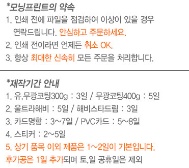
| Hello! Here at MorningPrint, we receive many amazing designs, and we really enjoy seeing the creative process the designers go through. We enjoy seeing the results received after we send these designs to print. We would like to share some of these creative designs with you to help inspire you as they have inspired us. |
|
| Business Card Design of the Month : March |
 |
Company Name : He Designs Too
Designer Name : Jordi Camps
Website : hedesignstoo.com
Order Details : Heavy Nouveau
|
|
| |
 |
| |
 |
| |
 |
| REVIEW |
| Q : Please briefly tell us about you, your company, and your products and services: |
| A : Hello, my name is Jordi Camps and I am a packaging and advertising designer in the wine and alcohol industry. |
|
| Q : How did you decided on the selected stock (Heavy Nouveau)? |
| A: This is the second order I have placed with this paper. It is a good thickness and colors on this uncoated stock look great. |
|
| Q : Can you walk us through your design process? |
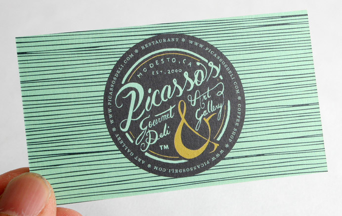
| A: Before jumping on the computer, it’s always important to figure out what the tone and concept of the piece should be. I start in my sketchbook, writing down words that describe what I want the mood of the piece to be and I start sketching. For this piece I knew it should be something that looked hand made. The client is a small coffee shop and art gallery and they were looking for something that would hit on both ideas. After finalizing sketches and having a good idea of what it should be like. Jumping in the computer and actually creating the piece is the last step. |
|
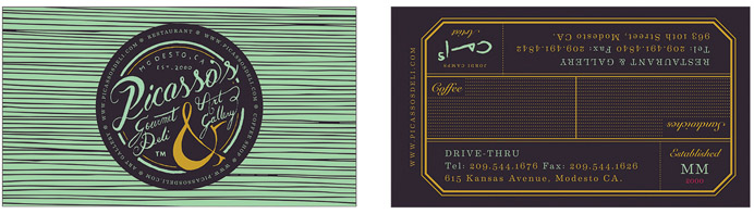
| Q : The back side design of your card is intriguing as half of the card is oriented one way and the other half is oriented the opposite way. What is the purpose of this? |
| A: Yes, I designed it that way because my client recently opened a second location which is inherently different than the first. The first is the restaurant and Art gallery, the second is a drive thru. I created the card in such a way that you can only read about one of the locations at a time while the other is upside down and illegible. |
|
| Q : A business card can hold a lot of different information how did you determine what information would be used for your design? |
| A: This was interesting because I designed in a way the resembles more of a handmade tag from a liquor package that a traditional card. I added information that I would normally not add to a card like the resident artist’s signature for that gallery and roman numerals speaking to the year the coffee shop was founded. The amount of information is really tied to the concept of the card rather than any desire to limit it in any way. |
|
| Q : Any tips for our readers who might be considering making business cards? |
| A: Most business cards out there are thought-less. They have no concept or personality yet, it is the one piece that a Consumer/Client interacts with. It should scream what the business believes and what it stands for. It will not only make your designs more interesting but it will create a lasting and great first impression of your client. |
|
| Q : Any plans for your next business card (stock / finishing options / design)? |
| A: Not yet, it all depends on what the next project calls for. |
|
| Q : How was your experience with MorningPrint? Did you experience any difficulties when using MorningPrint.com, or find anything to be inconvenient? |
| A: Not at all, It very easy, intuitive and good options. I would love if you guys had a 24pt or thinker uncoated stock though. |
|
| |
 |
 |
 |
 |
 |
 |


 About Us >
이달의명함
About Us >
이달의명함